09 October 2013

My new blog, and website

After years of telling myself that I should do it, I have finally dragged my own website, www.doctordada.com into the 21st century. The old site (still viewable at www.doctordada.com/old) was all hand-coded, which is why I had to have a separate blog, here. But my new website, running on WordPress, has an integrated blog. Other advantages are:

  • visitor comments
  • support for other languages (which I am using for Esperanto)
  • a much cleaner design

I have copied over a few entries from this blog but there’ll still be useful stuff here that won’t be available there.

29 April 2013

Does social media have a place in an art museum?

Dana Allen-Greil posted an article recently, “Everything that’s wrong with society”? Facebook Home in museums. The post was triggered by a TV ad from AT&T in the US, for a mobile phone running Facebook Home (an app that fills the home screen with a steady stream of Facebook posts). In the ad, a woman in an art museum is shown being bored and disengaged. But then she checks Facebook on her phone and suddenly she ‘tunes into’ the art. Grell asks,
“Is it a provocative take on how technology might bring museums to life by honoring the personal interests and experiences of visitors? Or a depressing documentary on how nothing—not even the rare beauty of great art—can earn appreciation and attention in a world obsessed with the immediate?”
Many people are offended by this ad and I know why. Yes, it would be a pity if an art museum visitor failed to engage with the art surrounding them because they were distracted by the ‘chatter’ of social media, and this ad seems to be encouraging exactly that. But, on the other hand, art museums often take their audiences for granted, assuming that all they need to do is put their ‘masterpieces’ on display and get people to come and see them.

Shortly after I started working as an art museum educator in 1982, there was a TV ad in Australia for Kit Kat chocolate bars, featuring a famous painting* from the Art Gallery of New South Wales, where I worked:


While the ad was current (and for some months afterwards), whenever I took a school group into the room containing that painting, one of the students would suddenly exclaim “The Kit Kat painting!” and the whole group would rush over to see it. At first I was thrown by this, because it upset the flow of my planned talk. But then I discovered that if I went with it, rather than resisting, the students would seem to get much more out of the rest of my talk, and their museum experience generally.

At the time, some of my colleagues expressed their horror that this iconic artwork was being ‘cheapened’ by commercialism. But I maintained that a connection was being made between the world of art (19th century art, in this case) and the students’ world (albeit mediated through mass media), and so it was in fact a positive thing.

I personally have no problem getting visitors (and not just school students) to imagine what a work of art would taste like, what piece of music would go with it, what sport the people in it might play, what it could be used to advertise, or what they could write about it on Facebook. As long as the artwork has a role to play. And, who knows, maybe further down the track some of these people might see this artwork again, feel some connection with it, and decide they want to know more about the artist, the period, the style. But, if not, that’s OK, too.

[* Incidentally, the painting is On the wallaby track, 1896, by Frederick McCubbin.]

Update: Nina Simon has written a blog post about this same ad, on Museum 2.0.
 

23 August 2012

Art and the voodoo paradox

Roy de Maistre, 'Rhythmic composition in yellow green minor' 1919 Roy de Maistre, 'Rhythmic composition in yellow green minor' 1919

Someone looks at an abstract painting. What does he or she ask? Probably "What is it?" or "What does it mean?". The answer, "It’s only a picture, only a surface covered with paint," will in no way satisfy.

It is impossible to eliminate the belief, even a hundred years after the birth of abstract art, even if one is an artist or an art expert, that any deliberate arrangement of marks must represent something. Let me demonstrate:

1. Find a picture of a face in an old magazine, preferably a face of someone famous.
2. Take a pencil (or pen).
3. Using the pencil, push in the 'eyes', until you create two holes in the paper.

How did you react? Did you feel that, somehow, you assaulted the ‘person’ in the photo? Did it seem to you that you were being just a little bit... evil? Why? I am sure that you don’t believe in voodoo, that you don’t create dolls of your enemies and push pins into them! But deep inside us all there is an ancient belief in voodoo, a belief that images have some power over the things they represent. You can see this when people get angry after someone destroys a national flag. And, of course, the flag in no way resembles the nation!

So, completely abstract, or non-figurative, art will never be fully accepted. However, this doesn’t have to worry us as, long as we understand the principle.

En Esperanto ≫

20 February 2012

La inkopentristo

(A story about art, in Esperanto)

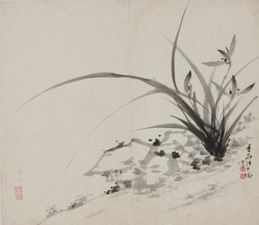
REN Xuda (Ĉinio) Orkideo 1809
Donaco de S-ro SydneyCooper 1962
Kolekto de Art Gallery of NSW, Sydney, Aŭstralio
Rakontisto: Iam en Ĉinio estis lerta inkopentristo, speciale famega por liaj figuroj de floroj, kiuj estis venditaj por tre altaj prezoj. Li havis amikon. Unun tagon la artisto kaj lia amiko paroladis.

Pentristo: Vi estas bonega amiko al mi dum multaj jaroj. Mi pentros por vi pentraĵon kaj donos ĝin al vi.

Amiko: Ĉu vere?

Pentristo: Jes, certe. Pentraĵon pri kiu, vi ŝatus? 

Amiko: Pri floroj, kompreneble.

Pentristo: Do, pri floroj ĝi estos.

Amiko: Dankon. Mi tre ekscitiĝas.

Pentristo: Ne dankinde.

Rakontisto: Semajno pasis kaj la amiko scivolis kiam la promesita pentraĵo estus preta, sed li diris nenion. Alia semajno pasis kaj ankoraŭ pentraĵo ne aperis. Tiam, post monato, la amiko demandis al la artisto:

Amiko: Pardonu min, mi ne riproĉas vin, sed ĉu vi memoras la pentraĵon kiun vi promesis al mi? 

Pentristo: Ho, kompreneble. Mi laboradis pri ĝi ekde mi promesis ĝin. Kiom da tempo daŭris? Ĉu tri semajnojn?

Amiko: Unu monaton.

Pentristo: Unu monaton, ĉu?

Amiko: Jes, sed ne gravas. Kompletigu ĝin kiam ĝi kompletos. Ne rapidu.

Rakontisto: Sed enkore, la amiko ja malpaciencis. Pasis alia monato – ankoraŭ ne pentraĵo. Pasis du pliaj monatoj. Fine, entute ses monatoj pasis. La amiko ne povis bridi sin. Li vizitis la pentriston ĉe lia domo.

Amiko: Saluton. Mi nur scivolas ĉu la pentraĵo estas kompleta.

Pentristo: Preskaŭ, preskaŭ. Fakte, mi kredas ke mi povas fini ĝin dum vi atendos. Restu ĉi tie; mi revenos.

Rakontisto: La pentristo iris en alian ĉambron kaj revenis post minuto kun papero, peniko, inkbastono, ŝtona bloko kaj akvo. Li instalis sin ĉe malgranda, malalta tablo. Li gutigis akvon sur la ŝtonan blokon kaj frotis ĝin per la inkbastono ĝis nigra inko aperis. Tiam, li mallevis la penikon en la inkon kaj metis ĝin super la papero. Li paŭzis momente... kaj ekpentris. Lia mano, kaj la peniko, moviĝis rapide kaj lerte. Post malpli ol du minutoj figuro de orkideo aperis sur la papero. Ĝi estas majstroverko.

Pentristo: Jen via pentraĵo.

Amiko (mirege): Sed, sed... vi atendigis min dum ses monatoj por ke mi ricevi la finitan pentraĵon, sed vi faris ĝin dum malpli ol unu minuto! Kial? Mi ne komprenas.

Pentristo: Sekvu min.

Rakontisto: La pentristo gvidis sian amikon en la alian ĉambron, sian atelieron. Tie, sur la granda labortablo kaj sur ĉiu muro estis pentraĵoj, entute centoj kaj centoj da pentraĵoj, kaj ĉiu estis figuro de orkideo.

Pentristo: Ĉiun pentraĵon mi pentris dum du aŭ tri minutojn, sed neniu estis sufiĉe bona por doni al vi. Sed mi sentis ke hodiaŭ mi estus preta, ke mi povus pentri la pentraĵon kiun mi deziris doni al vi.

Rakontisto: Do, la demando estas, kiel longe daŭris la kreado de la fina pentraĵo? Ĉu malpli ol du minutojn aŭ ses monatojn? Aŭ eĉ, la tutan vivon de la pentristo ĝis tiam? Vere, artisto ne povas krei sian milan artaĵon sen fini naŭcent naŭdek naŭ artaĵojn antaŭe.

19 November 2011

4P visits the Art Gallery: a blast from the past

The other day I was going through some boxes of children's drawings (all my children are adults now) and I came upon one of my daughter's exercise books from grade 4. I'm posting an excerpt here because it describes a school excursion to the Art Gallery of NSW. (It is exactly as written – no corrections.)
4P lerning to Look

tues 29th may  4p visits the art Gallery

The art Gallery is a place were you go to enjoy your self and thats what 4p did when they went to the art Gallery.

4p got the train at Tempe and got off at St James. 4p ate recess at Hyde park in front of a wishing fouwntane. After recess we went on the moving walk way. It was fun. We had to walk on the wet grass all the water skwerted up into our shoes. When we got to the art Gallery we went on a chair that went up and down when a man bangs down a hamer. Then 4p was split into three groups.

My dad took one group and two volintir gids took the two other groups. I was in my dads group of cours. There is lots of interesting thing to see at the art Gallery but your not aloud to touch. If you do touch you will get into BIG trouble. My dad and the two volintir gids talked about what the shapes the people in the painting would like and what colurse too. Dads group went down to the aberigenal exerbision then 4p had to leave. We had lunch on the bottom floor of center point then we went in the Queen Victoria bilding were mum took one group and miss poulos took the other. It was fun there to. Then the two groups met each other agen and we walked down to central station were we got on a train that would take us to Tempe station and we walked back up to the school.

21 February 2011

The Henry Ford Museum website - too much of a good thing?

I just had reason to visit the website of “The Henry Ford” (comprising The Henry Ford Museum and Greenfield Village)

This site is an example of what happens when the aim is to give visitors to a site as much control and as many options as possible, in the smallest possible space.

On the home page alone, I found:
  • 2 quick-link drop-downs: “I am” and “How do I” (see below)
  • 2 ticket-purchase drop-downs: “Purchase by venue” and “Purchase by event”
  • A search box
  • A login-in form: user name + password
  • A “Plan your visit” form: 4 fields + 5 buttons
  • A menubar with 13 menu items, each with a roll-over drop-down of up to 12 items
  • 13 buttons (apart from the ones as part of forms)
  • 20 text links (including 4 in a scrolling field and 9 in click-to-expand boxes)
  • 3 image links
  • an auto-start video (with sound) + 5 video links
Many of the features are good ideas by themselves. (I particularly like the “I am” and “How do I” controls; the auto-start video is a mistake, especially on a home page.) But taken together, all these elements would just cause bewilderment.

[More about the “I am” and “How do I” quick-links (shown as “smart site”):

Choices for “I am”:
  • Just Browsing
  • Educator
  • Private Event Planner or Bride
  • A Local Visitor
  • Group or Tour Planner
  • History Enthusiast
  • Tourist/Out of Town Visitor
  • Member
  • With Media
Each choice produces a different menu for “How do I”. Eg, for “With Media” the menu is:
  • Get Member Discounts
  • Buy an Annual Ride Pass
  • Upgrade my Membership level
  • Renew my Membership
  • Buy a Gift Membership
  • Donate to the Annual Fund
MoMA does a similar thing in its navigation footer-bar.]

07 December 2010

Collections on websites: Are museums getting less committed?

Recently, there was some discussion on the museum-ed discussion list, that began with this message:
Our museum has a mix of information/history and artifacts and we are designing a new website from the ground up. As we explore other’s websites, we get the impression that many museums of all kinds are downplaying their collections on their websites. This represents a change over the past several years when many museums’ websites placed their collections in the spotlight.

If this is indeed the trend, we are curious about the thinking behind it. Is it a question of overhead and web maintenance cost? Does this reflect a change in philosophy about the role of a website for a museum / a museum for its culture?

We are, as I said, curious. Thanks.

Gordon McDonough
Science Evangelist
Bradbury Science Museum
Los Alamos National Laboratory
Then came the following two responses:
We will hopefully be going through this process next year as well. Interesting observation; it does seem like many museum websites focus primarily on upcoming programs and/or temporary feature exhibitions. You often have to dig deep to find the permanent collection data. Are we afraid of “giving it away” or that information on the permanent collection will grow stale because it is, in truth, permanent?

Clayton Drescher
Education Manager
Petersen Automotive Museum
Los Angeles
and
While I would agree that museums are putting a greater emphasis on providing information on their sites about programs, events and exhibitions, I would not say that there is a move toward minimizing the collections. Museums in the Web 1.0 era were very focused on recreating their experience online – a virtual museum. A key factor in this was the prominent display of collections, and at that time there was a strong push toward digitizing and presenting collections and associated metadata. I would argue that this effort is still very much alive, and in many cases we have still only seen the tip of the iceberg when it comes to collections being wholly and accurately displayed online. In the Web 2.0 era, the focus is now on directly engaging the public – through providing timely and accurate information about onsite attractions as well as through social media channels. The rise of online dialog and participation in recent years has definitely led to a shift away from the one-way presentation format typically associated with collections. It has also brought to light the limitations of typical top-down hierarchies in organizing and displaying collections.

But the social web provides some great opportunities for museums beyond the obvious marketing channels. For example, right now we are working with a number of museums and organizations on redesigning their websites, including the Carnegie Museum of Art, the Gilder Lehrman Institute and the Monticello. All of these organizations have a strong focus on supporting robust and participatory engagement with their collections and online content. This includes faceted searching and browsing features, tagging, favoriting and commenting features, and greater cross-pollination and integration of collections and content throughout their sites. For many museums, their collections are absolutely central to their mission. Of late, there has been a shift toward engaging the public and driving the gate that has, in some cases, pushed the collections out of the limelight. I believe this is a timely but temporary response to both economic factors and social media trends. Ultimately I think that museums will find that their site visitors can and will engage with collections online through interactive and participatory frameworks that help to build meaningful and lasting connections between visitors and institutions, while enriching the online experience for everyone in the process.

Matthew Fisher
President
night kitchen interactive
For what it's worth, this was my response:

I think it’s unfair to associate collections necessarily with one-way, static presentation of content. And there’s nothing particularly “Web 2.0” about “providing timely and accurate information about on-site attractions”. Let’s face it, most museum website put their exhibition programs “front-and-centre” because:
  1. exhibitions change, so promoting them makes their websites look more dynamic, and
  2. exhibitions (or the major ones, at least) come with their own promotional budgets (while, sadly, collections don’t).
While exhibitions can be made to look exciting and dynamic, most museums still present them in a traditional, “Web 1.0” manner: text, images, videos and links.

And while there is the potential for collections to be more engaging and participatory, generally speaking they are still presented as a choice between browsing (using the museum’s curatorial hierarchy) and search (simple or complex). As Matthew said, museums can (and some do) add to this with “faceted searching and browsing features, tagging, favouriting and commenting features, and greater cross-pollination and integration of collections and content throughout their sites”. But just having features like these doesn’t guarantee that a museum’s collection online will be engaging. They can easily be hidden behind faulty interfaces. For example, the collection sections of many museum websites still confront visitors with one or more search fields. My immediate reaction in these cases is usually, “What should I search for? What kind of stuff does your collection contain?” Sure, if I persist, I might get the opportunity to refine my search results (aka “faceted searching”), but if that consists of more text fields without any help or prompting, the engagement level drops again.

So, the challenge for museums is:
  • to show how exciting their collections are
  • to provide multiple paths for browsing them (ideally with some of these paths provided by the visitors themselves) and
  • to actively encourage their visitors to engage with them.